Showing posts with label Poster. Show all posts

Monday, 16 April 2012

Comparing products

With both the magazine and poster I used other products to give me ideas on how to make our products. By doing this I was able to make the magazine a lot easier than if I started from scratch and it also showed me what would work well with my photo.

POSTER
We got our initial idea from 'The Sixth Sense' poster. As you can see we made the main focus of the person (in our case the legs of a person) very dark and almost black. Then the outside made into deep red and orange colours. Although on 'The Sixth Sense' poster it is only in the middle of the page with a black background we all felt that we needed the whole of the page to be taken up by the legs and therefor had no room for the black background. We did not copy the text for the poster as ours is very different. Where as they have 6 different words to explain the whole film we needed 2 lines in a sentence structure to do ours. Also we added the small print text at the bottom of our poster. Although this is not seen in the other poster we believed we needed some text at the bottom and by looking at other Sixth Sense posters and other film posters, many do have this small text at the bottom. By comparing these posters it can easily be seen that we have used elements from it but also used our own ideas to create it.

Magazine


With the magazine cover it is a lot more obvious where I have got my ideas from. Although at first I was not going to use the Empire magazine cover after researching and discovering this one it seemed the clever thing to do to use this as my initial idea. This is because both pictures have women on the right hand side and both are slightly curved over. The text on both products as you can see are very similar by having different sizes to show the importance of each bit (the more important the bigger the text). Also to do with text the 'Transformers 2's' section has a blue background to stand out and it shows very clearly what film Megan Fox is appearing in. Empire used the colour scheme of light blue, on mine I have stayed with the red which links with the dress and 'M'. I have also used the idea of putting the three pictures on the left hand side showing what else is in the magazine. I stayed with the red theme by putting the text in red and the rest in white. However although there are many things that are the same I have put a few differences on my cover. Where the bar code is on the Empire one I felt it did not look right on mine so I decided the put it on the right hand corner with the price and date next to it. Also my title is different to that of Empire's where it is very bold and goes behind the picture of Megan Fox I wanted mine to stand out against the photo so made the background black and fade into the photo causing my title to stand out against the cover and not be hidden.

Tuesday, 27 March 2012

Creating the poster

We all decided that this was going to be our initial photo which we would edit to create our poster.
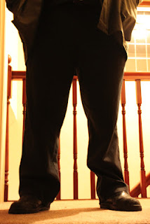
The first thing we did to edit it was to change the contrast and lighting of the whole picture so it was more of a red/deep orange around the legs and the legs itself were almost if not completely black. This made the legs stand out a lot more against these deep colours.

The next part we edited was the actual background, because as you can see above there are odd white patches in the background on the left hand side that we did not want, but instead wanted it all one colour so at first we decided to make it all white to see what it looked like. However as you can see below that did not work our as well as we first thought it would.
So instead we used the 'clone' tool to pick out an orange from the colours already there and use that instead and cover all of the white section in that deep orange. And as you can see below it looks much better than before and produces a shadow like image because of the darkness of the colour.
The next step was to add our text onto the poster. We used the same text as we used in the trailer, as it then links together more, we put the Seized in big block capitals and in a light brown so it can be seen. We then added the smaller text below, which was also in our trailer, but in a white so it stands out against everything else.
The last bit we needed the add was the small print text that ran along the bottom of the poster. We looked in detail at other sixth sense posters to see what they wrote at the bottom (at the one we were looking at before did not have this writing) and decided that we would use most of the text at the end of the trailer, saying who produced and made it, and put that at the bottom of the poster.
 To complete the look we added an extra few mm to the bottom of our poster and used the 'clone' tool again to copy other sections of the carpet. This was done for two reasons, the first was because in the picture above you can slightly see the ridge of the other carpet from another room so we wanted to remove that if we could. The other reason was we felt it was too squashed at the bottom and it looked as though he was standing on top of the text. By making it slightly longer we were able to fix this problem and also have room to put a website at the bottom.
However after looking at it and discussing it with a teacher and other students we believed that there needed to be something more on the poster. We decided the play around with the white text as we felt that the poster does not really tell anyone what the trailer is about. In the end we added the text below and we all feel that it tells people what it is about without giving too much away.


Second photos for poster

After deciding we were going to use the shots of the abductors feet as our poster picture, I went back home and took lots more pictures. I used three different affects: Nightview, Portrait and No Flash to create three different photos. This was so we had a varied selection that we could choose from.


We decided that the last photos (using Not Flash) were best suited as we needed the body to be black and the outside bright, which is what these photos do. So with some editing in Photoshop we could create the photo we need. I also took some photos of the abductor holding a knife by his side (pictures below) however we realised that if we used these photos it would not link with the ending of the trailer and he is not holding one, for the reason on continuity we decided against using any of these photos.


create an animated gif

Wednesday, 14 March 2012

Rough plan for poster

We made this rough plan of our poster so when we went back and took most photos we new exactly what we wanted. It meant we did not need to take lots of other photos but instead concentrate on one specific idea and just try different lighting instead of different positions

Monday, 12 March 2012

Editing the poster picture

When making our poster we decided to use the Sixth Sense poster as a guide to how we wanted ours to look. This is because the simplistic-ness of it, of just a boy with in the middle of a bright 6 with a black background, shows exactly what it is and also stands out because the bright orange/yellow catches your eye. Although our poster will be different to this we believe if we keep close to how they have produced it, it will work well with our trailer.
Here is our first attempt at editing the photo that will be on our poster. We changed the contrast/lighting of it to make the legs very, if not all black then the orange background making it more vibrant. Although this is only our first attempt we believe that when we re-take the photos, so it is more centred and in the right hand corner it does not have two separate room surfaces in it.


Tuesday, 6 March 2012

Planning the poster

For making the poster the three of us have decided to split up and work on the different sections then combine ideas, thus saving us time and allowing us all to produce the best of the specific section we can. There will be one person editing the photo that we will use, one person looking into the fonts and the size/colouring of it and the other person will be looking into what needs to be said in the texts that will appear. We will keep on working as a team by looking at what each other has done and to see if it will all fit together then if not we will change the ideas around and help each other if need be.
We decided that:
I will be editing the Photo,
Jeni will look into what needs to be said in the texts,
Charmaine will create the fonts and colourings.

Monday, 5 March 2012

Feedback

It is always very important to gain feedback on our trailer and ancillary tasks so we know what we need to change or what looks the best so as to keep that. On our blogs we are able to see who around the world is looking at our blogs. Although it does not give us specific feedback it helps to know that people are looking at it. Also on all of my posts you are able to comment on things which is very helpful. For example my teacher added a comment under one post explaining what needs to be done to help me. This was extremely helpful as I then added more posts about the area in which we were filming.

Tuesday, 28 February 2012

Ideas for poster pictures

When filming our trailer we also decided this would be a good time to try and take some pictures for our poster. We decided on two ideas, the abductor on the stair case and the feet of the Abductor by the door. Both are scenes from the trailer so we believe they will link well together.

We all thought this would be a good poster idea as it would show the shadow of the abductor giving the scare factor as you do not see his face and any features at all because of the bulky coat he is wearing. However when actually taking the photos of him they were not as we expected. Because of the wooden bars that are on the staircase it blocks a lot of him off and does not give the same affect it has in the trailer. Also by either adding carpet or the window above him it ruins the sense of fear slightly and just looks wrong.


This picture we believe is a lot better then the one above. It does not give anything away such as the abductors face or figure but only the shoes and trousers he wears. Also with editing we can make sections stand out more then others causing the poster to look like the Sixth Sense one that we looked at earlier. We like this one because it was simplistic but easy to understand what it is about, which we hope our poster will also do. Below is other shots we took of the same position, but in different ways, but we all believed that this one was the best overall.


Thursday, 8 December 2011

Costumes

The clothes, make-up and hair are all very important for all three parts of our project. If we do not get it right it could jeopardise everything.
LILY
'Lilie's' make-up needs to be smudged and made to look as thought she has been wearing it for ages but if instead looks perfect it will not give the effect of her being drunk and had a good night. Also when she is trapped in the cupboard her face needs to have black smudges all over it causing it to look dirty and as though she has been there for a while.
The clothes she is wearing is a bright red dress to represent the danger that she brings. However she is also wearing a white cardigan to contrast the red to show her innocence and purity. These colours work well together as we see how she is in danger but also how she has no idea when, where, how or why.
Her hair needs to be slightly messy at the beginning after the party otherwise if it was perfect it would not give the right impression of her being to a party and getting drunk. At the end of the trailer when she is in the cupboard her hair needs to be very messy as she would have been trapped in there for a while and trying to escape.
SHANNON
Her make-up and hair can be normal with it being very plain and simple for example her make-up would be very limited as she is more worried about finding her friend and her hair can either just be tired up quickly or let down to show she has not had much care put into it.
Her clothes ate much like Lily's but the other way round. When she is putting pieces together to try and find her she is wearing a white shirt with jeans and when she has gone outside to find her she is wearing a red and black cardigan. This shows how alike her and Lily are and also how her purity of trying to find her friend may lead her into danger especially the closer she gets to finding her friend.
CHELSEA
Her make-up and hair are different to that of the other two characters. She takes more take and does she make-up nicely with more on as well. Her hair will either be up but put up nicely or down and straightened. This shows she cares more about her appearance than finding her friend.
Her clothing will be dark either a black, dark green or dark blue. This shows she is mysterious and can hide away and does not stand out easily. Showing she does not care about anything but also that she could have something to hide about their friends disappearance.
ABDUCTOR
Although they are only in it for a short amount of time there clothing is very important. They will be wearing a big jacket in a dark colour, preferable black. This is so the outline of the person could be false and just the jacket shape. We may make him wear a hat to disguise his head more but this is not essential.

Friday, 4 November 2011

Research on movie posters

From the research I did earlier in the year in thriller films I have picked out those films and found their movie posters. From doing this we can see how most thriller movies posters are designed then base our poster on that type of design.

The poster for 'The Sixth Sense' in very simple. The black background makes the orange writing and number 6 stand out dramatically. It draws people in as it is unusual and the bright red/orange/yellow/white stands out. However what I do not like is the writing at the bottom as it is hard to read and the colours are the very bottom do not stand out as much as they could do. If they were white like the title it would look better as it is easier to read and see.


I do not like this poster as I find it hard to read because the colours blend in too much with the background image and colour, especially that of the text in the middle going down and the text at the bottom. However what I do like is the pictures of the two men  that blend in making them look mysterious. Also i do not like how dark the colours are, I do not feel like it would stand out very well anywhere but only blend in with the surroundings. The good thing about the poster is how clear the name of the film is.
I think this poster is very affective. This is because the person in the background, which I believe is a woman, is very creepy looking because oh her pale white features and red eyes making her seem menacing and scary. Also the butterfly/moth on her lips stands out as the colours are the complete opposite to that of her white face. The contrast of the two catches peoples eye as it is so different. Also i like that it is very easy to see the name on the film and all the other text is also very easy to see and read.
 I like this poster because it clearly shows the main character in the film as he in placed in the middle of the poster and bigger then that of the other pictures. It also has shots from the actual film int he background. The writing on it his an actual quote from the film and it gives us an insight of what  the film is about. Also the text is very bright which stands out against the dark background. However I do feel that there is too much going on in the poster and prefer the most simplistic designed ones.
 I do not like this poster because I do not feel it shows what the film is about. When looking at the poster I see it as because an 'End Of The World' movie but instead it is about dreams. Also although the text is in red the type of text it is in makes it harder to read and does not stand out as much as it should do. Also the text at the bottom is blue like the rest of the poster causing it to not be seen as easy also. However what I do like about the poster is the colour scheme. As it has kept to one colour, blue, and not gone too over the top with the colours. 


The last poster I am looking at I feel works very well for the film. It shows the two main characters and the obviousness that one has gone 'crazy.' It also stands out as it is close up of two peoples faces and one looking very frightened in the corner. The text stands out very dramatically on the poster as the red shows the danger and because it is so big and bold you keep being drawn to look at it. Although very simplistic I feel it works very well.


From this research I believe that the simpler posters work the best as there is not too much going on that you do not know where to look. Also the title must contrast the colours of the poster to make it stand out dramatically causing people to remember it in their minds.

Sunday, 25 September 2011

Target audience

To make a product the target audience needs to be established at the very start, this is so the products can be made to fit. For our target audience we are going for mid to old teenagers (aged 15-19). This is mainly because we, ourselves are in this age boundary (17/18) so we would know what we would like the see in the cinema making it easier for us to design aspects of the poster and magazine and also what to put in the trailer.