 I searched on Google to find a magazine front cover that had the same styled photograph as I had and found this one from Empire (a magazine I had already looked into slightly). This photo links better with mine as both girls are on their right hand side with a blank space on the left. So instead of re-doing everything I have decided the keep the photo as it is (black and white with specific pieces in colour) and change the layout of the text to fit better.
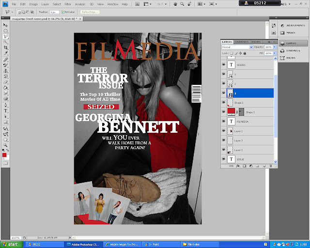
The first thing I did was to change the text font and size so it would look like the one above. I changed the title of the magazine as well as it just did not look like a magazine title and the font I used was not right. I tried to link the two as much as possible within the text as I believe it would look so much better.
However the title does not look very professional so I changed the text again to a sharp edged one (like Empire) and it looks much better. I also used photos from last years AS task from the girl band 'Sweetheat' which I made up. I uploaded three of the best pictures, one of each girl, and put them in the bottom left corner. I also underneath them put a red stripe.
I then added more text over the three pictures are the bottom so people new what they were about and moved the bar code to the bottom as I believe the right bottom corner needed something, but not big, and by adding that and the date and price it filled the gap but not overpoweringly.
However there was a slight problem with the text in the left hand corner it was very hard to read. So what I did was I changed the text colours around slightly but also changed the pictures around as I realised it was the yellow shirt that was causing the problem so by putting that at the end where no text was over the top it solved the problem. I also thought you could not see the title as clearly as you should so I made the top section black and fade into the picture after the title and as you can see the title stands out dramatically more than before.
I believe this is much better than my first try at the front cover and am very pleased with the end product. Here it is again but in large so it can be seen a lot easier.


No comments:
Post a Comment