From the research I did earlier in the year in thriller films I have picked out those films and found their movie posters. From doing this we can see how most thriller movies posters are designed then base our poster on that type of design.
The poster for 'The Sixth Sense' in very simple. The black background makes the orange writing and number 6 stand out dramatically. It draws people in as it is unusual and the bright red/orange/yellow/white stands out. However what I do not like is the writing at the bottom as it is hard to read and the colours are the very bottom do not stand out as much as they could do. If they were white like the title it would look better as it is easier to read and see.
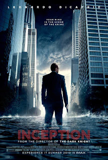
 I do not like this poster as I find it hard to read because the colours blend in too much with the background image and colour, especially that of the text in the middle going down and the text at the bottom. However what I do like is the pictures of the two men that blend in making them look mysterious. Also i do not like how dark the colours are, I do not feel like it would stand out very well anywhere but only blend in with the surroundings. The good thing about the poster is how clear the name of the film is.
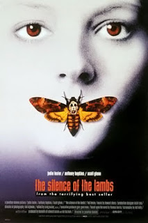
 I think this poster is very affective. This is because the person in the background, which I believe is a woman, is very creepy looking because oh her pale white features and red eyes making her seem menacing and scary. Also the butterfly/moth on her lips stands out as the colours are the complete opposite to that of her white face. The contrast of the two catches peoples eye as it is so different. Also i like that it is very easy to see the name on the film and all the other text is also very easy to see and read.
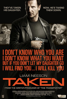
  I like this poster because it clearly shows the main character in the film as he in placed in the middle of the poster and bigger then that of the other pictures. It also has shots from the actual film int he background. The writing on it his an actual quote from the film and it gives us an insight of what the film is about. Also the text is very bright which stands out against the dark background. However I do feel that there is too much going on in the poster and prefer the most simplistic designed ones.
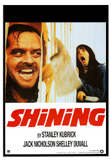
The last poster I am looking at I feel works very well for the film. It shows the two main characters and the obviousness that one has gone 'crazy.' It also stands out as it is close up of two peoples faces and one looking very frightened in the corner. The text stands out very dramatically on the poster as the red shows the danger and because it is so big and bold you keep being drawn to look at it. Although very simplistic I feel it works very well.
From this research I believe that the simpler posters work the best as there is not too much going on that you do not know where to look. Also the title must contrast the colours of the poster to make it stand out dramatically causing people to remember it in their minds.


This is a good start to your research. I need you to become far more focused in your research. Par down the choices so that it is clear about the way you will try to make your own poster.
ReplyDelete