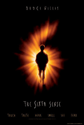
When making our poster we decided to use the Sixth Sense poster as a guide to how we wanted ours to look. This is because the simplistic-ness of it, of just a boy with in the middle of a bright 6 with a black background, shows exactly what it is and also stands out because the bright orange/yellow catches your eye. Although our poster will be different to this we believe if we keep close to how they have produced it, it will work well with our trailer.

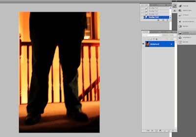
Here is our first attempt at editing the photo that will be on our poster. We changed the contrast/lighting of it to make the legs very, if not all black then the orange background making it more vibrant. Although this is only our first attempt we believe that when we re-take the photos, so it is more centred and in the right hand corner it does not have two separate room surfaces in it.
 When making our poster we decided to use the Sixth Sense poster as a guide to how we wanted ours to look. This is because the simplistic-ness of it, of just a boy with in the middle of a bright 6 with a black background, shows exactly what it is and also stands out because the bright orange/yellow catches your eye. Although our poster will be different to this we believe if we keep close to how they have produced it, it will work well with our trailer.
  Here is our first attempt at editing the photo that will be on our poster. We changed the contrast/lighting of it to make the legs very, if not all black then the orange background making it more vibrant. Although this is only our first attempt we believe that when we re-take the photos, so it is more centred and in the right hand corner it does not have two separate room surfaces in it.
No comments:
Post a Comment