Thursday, 29 March 2012

Second photoshoot for magazine

We all decided that the first shots were no good so instead I went out and took some more photographs of 'Lily' but this time in the red dress she wore in the trailer. I decided to do it outside as it would link with the beginning scene where she got abducted. Below are the four best photos from the 30 I took.

This first photo did not look right at all , this was because her hair was straight and done nicely whereas it should be messy. Also she does not look scared enough. The picture on the right is better as her hair is messed up more, as though she has be struggling, but she is smiling instead of looking terrified.

These two photos were slightly better and she looks more scared than the first two. However the one on the right you can slightly see a bin in the background, which at the time I did not notice and the one of the left, although lots better then that of the others, still did not look right and looked to fake to be used on the cover.

Tuesday, 27 March 2012

Creating the poster

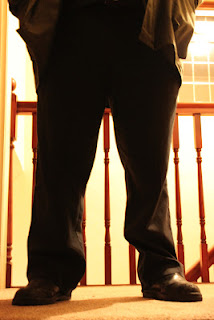
We all decided that this was going to be our initial photo which we would edit to create our poster.
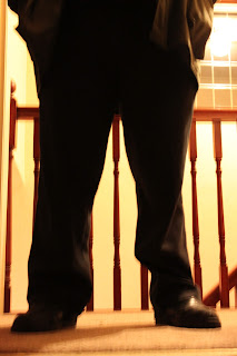
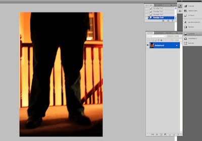
The first thing we did to edit it was to change the contrast and lighting of the whole picture so it was more of a red/deep orange around the legs and the legs itself were almost if not completely black. This made the legs stand out a lot more against these deep colours.

The next part we edited was the actual background, because as you can see above there are odd white patches in the background on the left hand side that we did not want, but instead wanted it all one colour so at first we decided to make it all white to see what it looked like. However as you can see below that did not work our as well as we first thought it would.
So instead we used the 'clone' tool to pick out an orange from the colours already there and use that instead and cover all of the white section in that deep orange. And as you can see below it looks much better than before and produces a shadow like image because of the darkness of the colour.
The next step was to add our text onto the poster. We used the same text as we used in the trailer, as it then links together more, we put the Seized in big block capitals and in a light brown so it can be seen. We then added the smaller text below, which was also in our trailer, but in a white so it stands out against everything else.
The last bit we needed the add was the small print text that ran along the bottom of the poster. We looked in detail at other sixth sense posters to see what they wrote at the bottom (at the one we were looking at before did not have this writing) and decided that we would use most of the text at the end of the trailer, saying who produced and made it, and put that at the bottom of the poster.
 To complete the look we added an extra few mm to the bottom of our poster and used the 'clone' tool again to copy other sections of the carpet. This was done for two reasons, the first was because in the picture above you can slightly see the ridge of the other carpet from another room so we wanted to remove that if we could. The other reason was we felt it was too squashed at the bottom and it looked as though he was standing on top of the text. By making it slightly longer we were able to fix this problem and also have room to put a website at the bottom.
However after looking at it and discussing it with a teacher and other students we believed that there needed to be something more on the poster. We decided the play around with the white text as we felt that the poster does not really tell anyone what the trailer is about. In the end we added the text below and we all feel that it tells people what it is about without giving too much away.


Second photos for poster

After deciding we were going to use the shots of the abductors feet as our poster picture, I went back home and took lots more pictures. I used three different affects: Nightview, Portrait and No Flash to create three different photos. This was so we had a varied selection that we could choose from.


We decided that the last photos (using Not Flash) were best suited as we needed the body to be black and the outside bright, which is what these photos do. So with some editing in Photoshop we could create the photo we need. I also took some photos of the abductor holding a knife by his side (pictures below) however we realised that if we used these photos it would not link with the ending of the trailer and he is not holding one, for the reason on continuity we decided against using any of these photos.


create an animated gif

Monday, 26 March 2012

Initial design for magazine front cover

To make it easier for us to produce a good quality magazine front cover we made a paper version which just told us where everything will go.

Friday, 23 March 2012

Feedback for final trailer

To discover what people liked/disliked about our trailer we decided to put on Facebook and Tumblr for everyone to see. We put it on about 6pm on a Friday night as it is one of the busiest times so more people would see it and therefor comment on the link. We also put it on YouTube for worldwide audiences to see. We're going to leave it for a few days and see how many, overall, comments/likes/views it gains.
Friday 30th March
After leaving it for a few days these are all the results we gained.

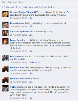
These are all the comments that we gained from putting our trailer onto Facebook to the public to see and comment on. When looking through all the comments we were happy to see that everyone really liked it and gave us very positive feedback. People seemed to really like the last part of the trailer with the abductor coming up the stairs and Georgie in the cupboard and found it very scary which is what we were all hoping for.
We also we very happy to see that in the short period of time we gained 90 views on our trailer which we did not expect at all.

Chamaine also put it up on Tumblr and we gained many likes and comments which also show that people felt scared from the trailer. There was also a comment that gave us advice in what would be better saying there needed to be breathing in the background in some points in the trailer to make it even scarier.
First photoshoot for magazine

For the magazine front cover we decided that we would make her the focus of everyone's attention by making her take up the majority of the page. The pictures below are not any that we are going to use but just test shots in which we looked at what we would make her do. All the pictures are of her smiling which we realises would not work as we need her to be in character so it will link with the trailer. We will instead use ones of her looking scared. There is also the option that we may use a picture where she is in the cupboard (bottom section of photos) and all you can see a slight bit of her face as they will link directly to the trailer.

create an animated gif

create an animated gif

Taking the photos

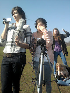
Here are photos of us taking photos of 'Lily'. We did it at school one lunch time and asked for the lighting and white back screen to be set up for us so we had plenty of time to take the photographs. We put one light to the left of her and one to the right so there she was evenly lite up without any huge shadows that would cover her face or body. We made one light slightly higher than the other which meant the lighting was also evenly spread over her and not all on one direct point.

Tuesday, 20 March 2012

Finished Trailer

Jeni decided to take a picture of me and Charmaine editing our trailer and putting it together. Below is our final product!

Friday, 16 March 2012

Volume

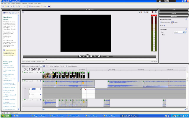
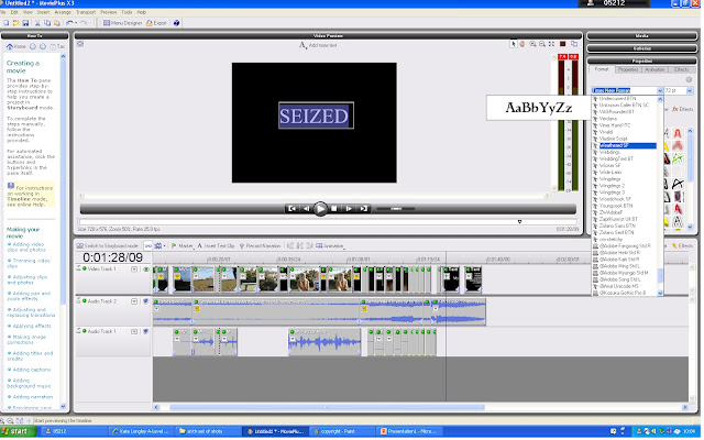
One of the key elements in the trailer is the music that is always there and it builds the tension throughout. We wanted to make some parts of it quieter and louder then others so we have to change the volume in sections. For example the print screen below is where Lily screams when the screen goes blank. We made this go as loud as it could so it stood out against all the other sounds. Also the other print screen seen below is when we increased the volume when SEIZED appeared. It gives a spooky atmosphere and because its so loud people will concentrate on it more meaning they will remember the title of the film.

Font for trailer

In our trailer we have four sections of text all of which we want to look the same with the same text and affect. We used the font Weathered SF as it has a rough edge which links well with the trailer as a smooth edge would be more for a happy/romantic film.
To change the text font and affect we had to highlight the text and use the scroll down to find the suitable font. We then had to press affect and change it to 'glow' and 'glow all' this causes the beginning of the text to glow before showing what the text says, giving an spooky feel.

Thursday, 15 March 2012

Edit to soundtrack

When we were putting the music into the trailer we discovered it sounded awful and instead of making it scary it made it funny because the music did not fit as well as we first hoped. Where we had edited the music to fit how we wanted to we did not realise how different the two clips would sound next to each other and we ended up having different instruments playing next to each other, causing it to sound dreadful.So what we deiced to do was look again at artists which do the eerie/scary/creepy type of music we were looking for.
We first looked at a composer called 'Hans Zimmer' who composed the soundtrack to Inception to see how his music created the tension to build and that we could perhaps go with something he has done, But as you can hear below this does not fit well with our trailer at all as it is too calm, and although it builds the tension very well it does not have enough harsh sounds that we need in our trailer.
However by looking at him we realised that we did not need such harsh tones all the way through the trailer but at times we could apply a quieter sound, which actually built the tension up more because when the harsh sounds did appear they stood out even more than they did before.
We looked at 'Penderecki' again but looked at more of his music and discovered one called 'Threnody for the Victims of Hiroshima' This we believed was even better than the one we heard before as it was so long and had loud and quiet sections that editing these bits together would be a lot easier and would more importantly work and sound well together.

Eighth set of shots

For our final set of shots we needed to re-film Shannon and Chelsea's section as there were silly mistakes such as leaving equipment in the shots without realising. We went to Dartford Heath and asked a few of our friends to help us as well as Charmaine was unavailable and we needed people to film and do the sound for us. Luckily a few friends were available at the time we wished to film.
We re-shot the whole scene again as we were in different clothes and it was a very sunny day, which was not so when we filmed before. We added the section of us two going to sit on the chair as before it did not make sense when suddenly we appeared on the bench, so this small shot will help. Also when filming from behind the bushes we asked if one person could breath quietly into the mic so it sounded as though someone was there, unfortunately this did not work as well as we hoped and ended up sounding like wind, however we still believe the shot to be very important in the trailer.


Wednesday, 14 March 2012

Rough plan for poster

We made this rough plan of our poster so when we went back and took most photos we new exactly what we wanted. It meant we did not need to take lots of other photos but instead concentrate on one specific idea and just try different lighting instead of different positions

Tuesday, 13 March 2012

Rough cut 2


Here is our second rough cut of the whole trailer there are still things needed to be done however:
1) Add in the background music.
2) Add sound of thumping when abductor is coming up the stairs.
3) Re-shoot the scene of me and Jeni on the field as there is equipment in the shots.
4) Add Titles at the beginning of the trailer.
However even though they are still things needed to be done, overall this rough cut is much better then that of the first. We used a different camera so the quality is much better which makes the trailer look more professional already. We also made it a lot quicker and jumpier and building the tension up more and more. The feedback that we gained from the new trailer was very good people said the trailer built the tension up straight from the start and the transitions for slip to slip were very good. The only things they said bad against the trailer was that it needed the music and to re-shoot the clips we already new we had to do.

Updated storyboard and specif shot drawing

 
Because our trailer has changed so much during our filming we decided to draw up a new storyboard to see what we needed to when filming. As you can see from this storyboard it is very different to that of the first one but we still have some of the same shots. There are also less shots then we had to begin with as we realised we had to cut down lots of our scenes as they were either unnecessary or were too long.

We also wanted to put different/unusual shots into the trailer so we can up with the idea to put the phone on the floor with the camera behind and film the two characters walking towards it. We made a rough drawing of what it will look like and how we would do it. In the trailer we all felt the shot worked very well and people were impressed by it.

Monday, 12 March 2012

Editing the poster picture

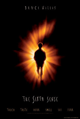
When making our poster we decided to use the Sixth Sense poster as a guide to how we wanted ours to look. This is because the simplistic-ness of it, of just a boy with in the middle of a bright 6 with a black background, shows exactly what it is and also stands out because the bright orange/yellow catches your eye. Although our poster will be different to this we believe if we keep close to how they have produced it, it will work well with our trailer.
Here is our first attempt at editing the photo that will be on our poster. We changed the contrast/lighting of it to make the legs very, if not all black then the orange background making it more vibrant. Although this is only our first attempt we believe that when we re-take the photos, so it is more centred and in the right hand corner it does not have two separate room surfaces in it.


Tuesday, 6 March 2012

Planning the poster

For making the poster the three of us have decided to split up and work on the different sections then combine ideas, thus saving us time and allowing us all to produce the best of the specific section we can. There will be one person editing the photo that we will use, one person looking into the fonts and the size/colouring of it and the other person will be looking into what needs to be said in the texts that will appear. We will keep on working as a team by looking at what each other has done and to see if it will all fit together then if not we will change the ideas around and help each other if need be.
We decided that:
I will be editing the Photo,
Jeni will look into what needs to be said in the texts,
Charmaine will create the fonts and colourings.

Monday, 5 March 2012

Copyright

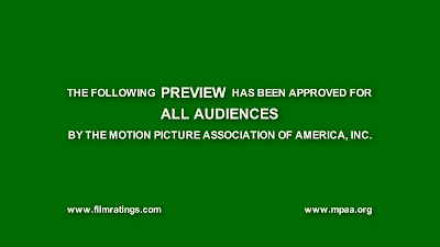
To make our trailer look like a professional one we need to add a copyright green screen at the very beginning of the trailer. We researched into different ones and came to the conclusion that this was the best one we found and easiest the edit to make our own one:
We took this from Google and searched into trailers and saw this was used often in films. However we could not just copy this picture and put it into our trailer we had to edit parts to make it legit.
The copyright photo below is the one we made ourselves by editing the original. We removed the two websites in the corners and also the last line. Then we made up two websites called 'www.filmmedia.com' and 'www.ppe.com' as they sound legit but also are not real. We changed the last line by removing 'motion picture association of America, inc.' and added our own interpretation of it. Although here it is easy to see the editing we have done because the text we have added does not have the dark shadow outline that the rest of the text does have. However when we put it in the trailer it does not notice. Also the other difference is the websites are a lot smaller  then that of the original. However this is only noticeable when compared to the real copyright, so when put into the trailer it does not matter.

Feedback

It is always very important to gain feedback on our trailer and ancillary tasks so we know what we need to change or what looks the best so as to keep that. On our blogs we are able to see who around the world is looking at our blogs. Although it does not give us specific feedback it helps to know that people are looking at it. Also on all of my posts you are able to comment on things which is very helpful. For example my teacher added a comment under one post explaining what needs to be done to help me. This was extremely helpful as I then added more posts about the area in which we were filming.