The clothes, make-up and hair are all very important for all three parts of our project. If we do not get it right it could jeopardise everything.
LILY
'Lilie's' make-up needs to be smudged and made to look as thought she has been wearing it for ages but if instead looks perfect it will not give the effect of her being drunk and had a good night. Also when she is trapped in the cupboard her face needs to have black smudges all over it causing it to look dirty and as though she has been there for a while.
The clothes she is wearing is a bright red dress to represent the danger that she brings. However she is also wearing a white cardigan to contrast the red to show her innocence and purity. These colours work well together as we see how she is in danger but also how she has no idea when, where, how or why.
Her hair needs to be slightly messy at the beginning after the party otherwise if it was perfect it would not give the right impression of her being to a party and getting drunk. At the end of the trailer when she is in the cupboard her hair needs to be very messy as she would have been trapped in there for a while and trying to escape.
SHANNON
Her make-up and hair can be normal with it being very plain and simple for example her make-up would be very limited as she is more worried about finding her friend and her hair can either just be tired up quickly or let down to show she has not had much care put into it.
Her clothes ate much like Lily's but the other way round. When she is putting pieces together to try and find her she is wearing a white shirt with jeans and when she has gone outside to find her she is wearing a red and black cardigan. This shows how alike her and Lily are and also how her purity of trying to find her friend may lead her into danger especially the closer she gets to finding her friend.
CHELSEA
Her make-up and hair are different to that of the other two characters. She takes more take and does she make-up nicely with more on as well. Her hair will either be up but put up nicely or down and straightened. This shows she cares more about her appearance than finding her friend.
Her clothing will be dark either a black, dark green or dark blue. This shows she is mysterious and can hide away and does not stand out easily. Showing she does not care about anything but also that she could have something to hide about their friends disappearance.
ABDUCTOR
Although they are only in it for a short amount of time there clothing is very important. They will be wearing a big jacket in a dark colour, preferable black. This is so the outline of the person could be false and just the jacket shape. We may make him wear a hat to disguise his head more but this is not essential.
Thursday, 8 December 2011
Lighting of the trailer
When filming our trailer for the movie one of the hardest things we discovered and still discovering is how to use the lighting.
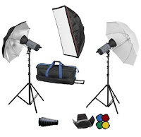 Because we are filming the majority of our trailer outside in a field we cannot use professional lighting such as the ones seen to the right because we have no source of electricity. This causes us many problems. We want the first section of our trailer to be filmed in the dark but we need some kind of lighting so the characters can be seen. So to try and overcome this we came up with a few ideas the first was to film in the daylight and then edit it to make it look as though we filmed in the daytime. But if you look at our second set of shots video it can be easily seen that the shadows from the sun can be seen on the floor making the clips look like they have been filmed in the daylight even with editing involved which is what we did not want. Our next idea was to simple film in the dark but use lots of torches to light up our character. Although this was better (see third set of shots) on some clips it is easily seen that we used these which is also what we do not want. So when we go filming again us have decided we will get even more torches but this time get big ones and place them on the floor so we do not have to hold them on the character but just so there is a background light and the character can be seen so it does not look wrong. Also it means there is not a person running along with 'Lilie' trying to keep lighting on her, if there are lots of torches perhaps in a line.
 Because we are filming the majority of our trailer outside in a field we cannot use professional lighting such as the ones seen to the right because we have no source of electricity. This causes us many problems. We want the first section of our trailer to be filmed in the dark but we need some kind of lighting so the characters can be seen. So to try and overcome this we came up with a few ideas the first was to film in the daylight and then edit it to make it look as though we filmed in the daytime. But if you look at our second set of shots video it can be easily seen that the shadows from the sun can be seen on the floor making the clips look like they have been filmed in the daylight even with editing involved which is what we did not want. Our next idea was to simple film in the dark but use lots of torches to light up our character. Although this was better (see third set of shots) on some clips it is easily seen that we used these which is also what we do not want. So when we go filming again us have decided we will get even more torches but this time get big ones and place them on the floor so we do not have to hold them on the character but just so there is a background light and the character can be seen so it does not look wrong. Also it means there is not a person running along with 'Lilie' trying to keep lighting on her, if there are lots of torches perhaps in a line.
Monday, 5 December 2011
Adding text into the trailer
In our trailer we needed to add text into it to show the title of our film, star ratings and the phrase "A MODERN CAT & MOUSE GAME" in between clips. These also help break the film clips up causing the clips to become quicker and quicker without it looking wrong. For example after the phrase it shows 'Lilie' then running and looking back whilst looking scared whereas before it was just clips of her moving slowly being slightly intoxicated. This tells the people watching that an event has taken part and her reactions have now changed dramatically.
Another text screen we wanted was one to show the title of our film and put star ratings on it. This caused us a lot of problems as we could not find a suitable star image. To over come this I cropped a poster with 4 stars on it and a black background and created the image below.
However this still caused us problems as we could not transfer the Photoshop picture onto the slid on MoviePlus. So from there we went into Word and tried to see if there was a star symbol that we could use which would easily be able to use on our slide as we could just enter a text box and type it in. However there was no symbols that were star shaped. In the end we decided to use the '*' key to see if it would look good or not. Luckily when we made the symbol bigger it looked good and professional. From this we decided we will just use the '*' symbol as our star sign.
For our text as well we added an effect to make it glow before showing the text this makes it look eerie and scary which was what we wanted in our text. It keeps in with the theme of a thriller film and like the film you have to wait to see what happens or what it reads in the case of the text.
Research on magazine front covers
For our other ancillary task we are asked to produce a front page for a magazine, promoting our film. Before we start making the cover I have researched into two different magazines to see the layout of them and the style of which they use to promote their films.
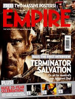 Although this cover is not one of horror I liked it because of the colours used and the layout of it. This is because all the colours are dark and brown giving an eerie feel to the cover. The layout I find is very effective as we gain a closeup of the main character in the film and in the background we see a machine of some kind but we do not get a full picture of what is happening, I believe this is good as the audience want to know what is going on and what the thing is in the background. With the title being big and bold and in white it stands out against the brown background so the viewers know what it is called.
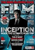 This photo I find very effective as he is standing in the centre causing him to seem very important, the clothes he is wearing and his posture also cause this. I also like the way 'FILM' is made. It is photos from the film put inside the text and I feel this works very well and could be something we do in our magazine. However what I do not like is the layout of the cover with all the text put down the middle and o not feel the colours of the text is right. The white of the text almost disappears at times as it is too close to the background colour.
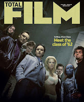 I really like this front cover as it is virtually just a photograph of all the main characters in the film with a small section of text just saying what the film is called. I really liked this because there is nothing else on the cover to distract our eyes so we can fully appreciate the photo. The photo itself is very good as it makes it look as though they are looking down on the reader causing them to look powerful and fearful. The colours are also very good in the fact they are quite dark with only one section where light is being let in. The facial expressions are all the same as well of them having a straight expression and staring into the camera.
 The thing I like about this magazine cover is mainly the layout of it as it is set in thirds which can easily be seen by Johnny Depp being on one side then the majority of the text on the other instead of it all overlapping each other making it harder to focus on one thing. Also I like the photograph being of Johnny Depp because he is such a famous and popular actor that when people see him on a magazine cover people will want to read what it is about and if it is promoting a new film people are more likely to see it if it has actors they like in it. This is the magazine front cover I like the most because of the layout and photo, however I do not think the colours will work well for our horror/thriller trailer so I would use this mostly as a template but then change the colours of it all to fit my theme.
EMPIRE
When finding front covers of magazines I decided to look for ones that are seen as frightening or threatening. This is because our film is a thriller which has an element of horror in it so I would not want to make a cheerful magazine with lots of bright colours in it. Here are the best three I found.
This cover caught my eye as it you cannot fully see this mans face but just around a third of it whist the rest in is the dark. This gives the audience a feel of fear from him and we know that straight away it will be a horror/thriller film. Also the colour of the text is in red and very bold with huge text, causing it to stand out and catch peoples eye. The use of red also shows how it represents danger, or how the man in the front is dangerous to us. I believe this is a good front cover as just by looking we gain an understanding of what type of film it will be and of course the name of it as it stands out almost as much as the title of the actual magazine.
Unlike the magazine above this does not give us a sense of horror but more of curiosity. The man at the front (Tom Hanks) is obviously going to be the main character as we fully see him and is in full lighting, showing he has nothing to hide from. However the man behind him is in dark colours and shadow over half of his face causing him to look as though he is hiding, it also causes us to be curios as to what he is going but also know he is an un-liked character. The background on the cover gives an eerie feel as it looks like mist/fog on a dark night which we represent with horror and fear. However I do not like how dark the title of the film is as it does not stand out against the background and can be hard to see at first glance.
 Although this cover is not one of horror I liked it because of the colours used and the layout of it. This is because all the colours are dark and brown giving an eerie feel to the cover. The layout I find is very effective as we gain a closeup of the main character in the film and in the background we see a machine of some kind but we do not get a full picture of what is happening, I believe this is good as the audience want to know what is going on and what the thing is in the background. With the title being big and bold and in white it stands out against the brown background so the viewers know what it is called.
TOTAL FILM
The layout of this magazine is slightly different to that of Empire. This is because Total Film magazine covers are mainly of the photo with only a small amount of text on the page. When i researched front covers for this magazine I looked more for the type of picture used rather then the type of film this was so I could see what type of photo would look the best then use the colours I researched on the magazines above and edit them together.
 This photo I find very effective as he is standing in the centre causing him to seem very important, the clothes he is wearing and his posture also cause this. I also like the way 'FILM' is made. It is photos from the film put inside the text and I feel this works very well and could be something we do in our magazine. However what I do not like is the layout of the cover with all the text put down the middle and o not feel the colours of the text is right. The white of the text almost disappears at times as it is too close to the background colour.
 I really like this front cover as it is virtually just a photograph of all the main characters in the film with a small section of text just saying what the film is called. I really liked this because there is nothing else on the cover to distract our eyes so we can fully appreciate the photo. The photo itself is very good as it makes it look as though they are looking down on the reader causing them to look powerful and fearful. The colours are also very good in the fact they are quite dark with only one section where light is being let in. The facial expressions are all the same as well of them having a straight expression and staring into the camera.
  The thing I like about this magazine cover is mainly the layout of it as it is set in thirds which can easily be seen by Johnny Depp being on one side then the majority of the text on the other instead of it all overlapping each other making it harder to focus on one thing. Also I like the photograph being of Johnny Depp because he is such a famous and popular actor that when people see him on a magazine cover people will want to read what it is about and if it is promoting a new film people are more likely to see it if it has actors they like in it. This is the magazine front cover I like the most because of the layout and photo, however I do not think the colours will work well for our horror/thriller trailer so I would use this mostly as a template but then change the colours of it all to fit my theme.
Tuesday, 29 November 2011
Third set of clips
For our third set of clips we tried a completely different way of filming it. Instead of doing it in the daylight then trying to edit it to make it darker and seem like it is filmed at night, we filmed in completely darkness and tried to add small amounts of lighting just so you could see the characters.
However when we filmed this it also like our other clips had problems:
Because we are filming on a field and in November the ground has slowly becoming more wet causing there to be lots of mud, this has an influence on how our characters walk and run. To overcome this we tried to film any running scenes with only a mid/long shot so the feet do not have to be shown.
The recorder we have been using for the rest of our clips was unavailable to use at the time we wished to record so instead we used my camera with a video recorder attached. It produced the same quality of picture but the only problem was when we went to upload the clips onto Adobe Premiere Elements it would not work, this caused us then to have to use a new programme called MoviePlus. This caused us problems as we had to spend valuable time learning how to use the programme rather then editing it. To overcome this we spent all our spare time learning how to use the programme until we understood it enough and started our editing process.
To focus on the character and not the surrounds was hard as the camera we used is not used to focusing on things so close up so for a lot of the time we had to stop and wait for the camera to focus so we could get a good picture. It worked on most of the clips but as you will see some it did no especially that on the close up of 'Lilie's' eyes where it focuses half way through.
However even though there was many problems again whilst filming we are slowly improving each time. Here is the beginning of the trailer of the clips we used:
Tuesday, 8 November 2011
Names for the film
For our trailer we want the title to stand out against all other films. It has to be around the idea of someone going missing or not being found as it is relevant towards the movie. We have brainstormed ideas and will carry out a tally chart showing which titles people prefer the most then from that we will decide which title we will use.
Below is our brainstorm idea of all the names we could think of that would work to our movie:
From these ideas we then picked out 2 we liked each and did a chart to see which people preferred here are the results:
It is clear to see that Seized and Vanished were the most popular choices with Seized winning only by 1 vote. The others were not as popular and The Blame Game and Contained we decided, before asking others, we no longer wished to use them so eliminated the straight away. However we are very happy with our title as it was one of our favourite ones and it fits in well with our film. Also we could not find any well known films with this as its title making it original and exciting because it is short and easy to say.
Editing of second set of clips
For our second set of shots we decided to do all of 'Lilie's' part and a section on 'Shannon's' and 'Chelsea's' part to see what the finished product would look like. We did it in the daylight so we could work out the shots and how they needed to be filmed, rather then doing it at dusk when we would not have the time to work everything out. By doing this we now know where to put the camera and how far we need to zoom in or out on the characters. This means when we next film we can go when it is slightly dark and know what we are doing and do not have to worry as much about getting it all done on time before it is too dark to be able to see any of the characters in the shots.
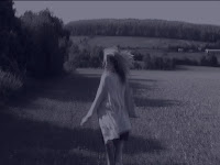 However we did try and put a dark tint on the clips to try and make it so it was dark. But as you can see it is very easy to tell it was sunny as on the floor there as shadows from the trees and the tint we used it more of a blue colour rather then a dark grey/black colour. Also for some reason when we edited the clip and put the blue tint over the top in made the shot go blurry which is another reason why we defiantly need to shoot the trailer at the right time during the day so we can produce a good trailer without the small unneeded problems.
 There were many other things that need to be changed as well. Mainly where the characters are in the shot and the landscape. When we next film we need to make sure 'Lilie' is not in the centre of the clip but to the side, this will make her look more vulnerable and scared rather than looking as powerful as she does now. Also when she is walking towards the camera we will make it so she walks past us almost instead of stopping it as suddenly as we did. The transactions between the shots we will also try and change as we use long shots then change to another one, we are going to try and edit it so the shots are not as long but shorter and goes back to the same shot at times so it is not so dramatic.
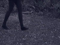 The other clip we need to change is when 'Lilie' is running and then we see a mysterious person walking behind her. It is very clear that it is a woman that walks behind so we need to either find a way to make it look manly by the clothes warn or to use someone else quickly just for that shot. E.g. a parent.
 For 'Shannon' and 'Chelsea's' part we only did one two shots, one of them walking towards the phone and them finding it and a shot from behind them walking as well. Just from this small part we know that we need to make sure the colours of clothing is different to each other , 'Chelsea' possibly wearing dark colours as if she is hiding away and then 'Shannon' wearing bright colours to show her personality and that she has nothing to hide.
Below is the finished movie of the second set of shots with editing.
Friday, 4 November 2011
Research on movie posters
From the research I did earlier in the year in thriller films I have picked out those films and found their movie posters. From doing this we can see how most thriller movies posters are designed then base our poster on that type of design.
The poster for 'The Sixth Sense' in very simple. The black background makes the orange writing and number 6 stand out dramatically. It draws people in as it is unusual and the bright red/orange/yellow/white stands out. However what I do not like is the writing at the bottom as it is hard to read and the colours are the very bottom do not stand out as much as they could do. If they were white like the title it would look better as it is easier to read and see.
 I do not like this poster as I find it hard to read because the colours blend in too much with the background image and colour, especially that of the text in the middle going down and the text at the bottom. However what I do like is the pictures of the two men that blend in making them look mysterious. Also i do not like how dark the colours are, I do not feel like it would stand out very well anywhere but only blend in with the surroundings. The good thing about the poster is how clear the name of the film is.
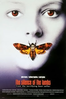 I think this poster is very affective. This is because the person in the background, which I believe is a woman, is very creepy looking because oh her pale white features and red eyes making her seem menacing and scary. Also the butterfly/moth on her lips stands out as the colours are the complete opposite to that of her white face. The contrast of the two catches peoples eye as it is so different. Also i like that it is very easy to see the name on the film and all the other text is also very easy to see and read.
 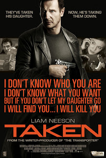 I like this poster because it clearly shows the main character in the film as he in placed in the middle of the poster and bigger then that of the other pictures. It also has shots from the actual film int he background. The writing on it his an actual quote from the film and it gives us an insight of what the film is about. Also the text is very bright which stands out against the dark background. However I do feel that there is too much going on in the poster and prefer the most simplistic designed ones.
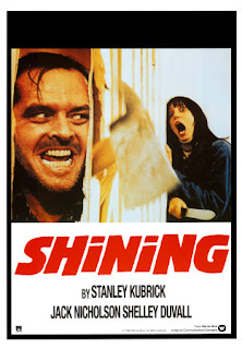
The last poster I am looking at I feel works very well for the film. It shows the two main characters and the obviousness that one has gone 'crazy.' It also stands out as it is close up of two peoples faces and one looking very frightened in the corner. The text stands out very dramatically on the poster as the red shows the danger and because it is so big and bold you keep being drawn to look at it. Although very simplistic I feel it works very well.
From this research I believe that the simpler posters work the best as there is not too much going on that you do not know where to look. Also the title must contrast the colours of the poster to make it stand out dramatically causing people to remember it in their minds.
Tuesday, 18 October 2011
First clips of the friends
On the 9th of October we did the first shots of the friends. Like before they were not serious shots but ones just to see if they worked well together or not.
However we had many problems this day:
The camera was not charged so we only managed to get one shot by using the camera (the first clip seen below). The rest of the shots we had to use Charmaine's camera on her phone, however the quality was not as good.
One of the friends (the accepting one) no longer wished to be in our trailer so instead I am now going to take that part as I will be reliable to be there each time we film and I will be able to help Shannon on what to do as we film also.
The weather was very windy so filming became difficult.
A dog kept getting into our shots so next time we will try and do it at a time or a place when dog walkers will not be interfering.
However although there were lots of complications with the filming we managed the film the clips below which gave us an insight on what we should do the next time we filmed.
Monday, 10 October 2011
Research on the weather
Before we filmed we made sure that the weather was going to be okay to film in as we did not want to set up for it then to start raining. As it shows in the picture it was said to be good throughout the day and only at night would it rain. We thought this would be perfect as it then would not be too light. However when we went to film the weather was wrong and in fact it was a very sunny day which caused problems with the clips but overall it helped with the filming as it was easy to see where to set everything up whereas it may have been harder in the dark.
Tuesday, 4 October 2011
Equipment
When filming out trailer we need suitable equipment for it to work well and give the illusion it is a proper film trailer. To do this we need good sound/picture and for it to be steady so it looks professional. For this to happen we are going to use the equipment below.
Friday, 30 September 2011
Sunday, 25 September 2011
Target audience
To make a product the target audience needs to be established at the very start, this is so the products can be made to fit. For our target audience we are going for mid to old teenagers (aged 15-19). This is mainly because we, ourselves are in this age boundary (17/18) so we would know what we would like the see in the cinema making it easier for us to design aspects of the poster and magazine and also what to put in the trailer.
Friday, 23 September 2011
Characters
For our trailer we are going to concentrate on three characters:
The victim
The victim
This is the person that will go missing at the start of the trailer.
She will have to look very innocent and be dressed in light/pale coloured clothes.
Our victim will be walking drunkenly home from a party so will have to be dressed up in party clothes and high heels. She will have to walk with a bit of a sway and possibly trip on the ground. As she walks she begins to fear something is following her and gets scared.
We are going to call her Lily as we researched names and discovered what Lily means.
She will be around 17 years old and has a tight friendship with two other girls. She will be walking home from a party to her house across a field, this is where she will go missing.
This is the person we will use to play her
Friend 1 (obsessed)
There will be two other characters which will be her friends that want to find her. This one is going to get obsessed with finding her and will not stop until she finds out what has happened to her friend. This will cause tension between her and the other friend as she almost gets too caught up in what has happened to her. She begins to blame everyone around her and her trust with everyone has gone.
We are going to call her Shannon as its quite an unusual name and is easily recognised when said in the trailer.
Friend 2 (accepted)
This is going to be the other character that will be used in the trailer. She will be the other friend of the victim but after a while she will become accepted that they will never find out what has happened to their friend. She will not be seen as much as the 'Shannon' as she will fade out of the trailer near the end as she does not wish to carry on searching for 'Lily' as much. However she will be an important character to the movie as 'Shannon' will start to become suspicious and blame them for the disappearance of 'Lily'.
I will be playing her in the trailer and her name will be 'Chelsea' as it does not sound like an innocent nice name.
Friday, 16 September 2011
First set of shots
On Thursday the 15th September we did our first set of shots. The three of us went after school to the selected area and did our first set of shots. We decided that we would just use this time to try and understand the equipment we were given and how our actor, Georgie, would look in different positions.
We came across many problems, one was the lightning. As ours is a thriller film we wanted it to be dark as she was going across field at night, but because we filmed too early in the day it was too bright. However by using Adobe Premiere Elements I was able to edit it to make it look darker. The first clip is too light and although the lighting was reduced you could still see the blue sky. I then tried to put it into black a white to see if that would work better. Although it gives the illusion of darkness better it still does not work completely. The last shot of the shoes works the best as it still gives the colours but in a darker/blue shade, causing it to look dark. It does not look 100% realistic but it is a lot better then what it first looked like.
We came across many problems, one was the lightning. As ours is a thriller film we wanted it to be dark as she was going across field at night, but because we filmed too early in the day it was too bright. However by using Adobe Premiere Elements I was able to edit it to make it look darker. The first clip is too light and although the lighting was reduced you could still see the blue sky. I then tried to put it into black a white to see if that would work better. Although it gives the illusion of darkness better it still does not work completely. The last shot of the shoes works the best as it still gives the colours but in a darker/blue shade, causing it to look dark. It does not look 100% realistic but it is a lot better then what it first looked like.
Some of the shots we did thought worked well and we were happy about how they ended up after some editing. The clips above of a close up of her shoes walking on the ground and her walking along the path worked well for the first shots. I like these shots because they tell us about the character and where she has been, also because we filmed that a bit later then the other slips, the lightning is slightly darker causing editing to be easier.
However, by filming at a lighter time we could easily see what would work and what would not for example the clip below is not going to work because the light reflecting off of her makes her look ghostly and does not work. I believe it would work better at night to shoot this shot as the light would not reflect off of her as much causing a ghost like appearance to happen.
Thursday, 15 September 2011
Where it will be set
For our trailer we wanted a place that had houses in the background, as this is where our victim would be coming from, but also was out of the way in the woods or a field somewhere. So for this we went onto Google Maps and looked the the location around each one of our houses to see if there was anything that we could use. We found out that around my house was the perfect spot with huge fields and woods either side with houses just in front.
We would be using the biggest field on the picture above as it also has a pathway between it and the smaller green field to the right of it. 

Here is a zoomed in version of the field and a possible house that our victim would be walking away from.
As we were filming our first shots we also took pictures of our surroundings and created a JIF to show the setting.
Wednesday, 14 September 2011
Trial on Adobe Premiere Elements
Today was the first time I have used this program and at first I found it very difficult to understand and find everything I needed. But after about an hour of looking at things and trialing everything I think I have understood the program more.
Our teacher gave us different camera shots and told us to put them together to create a tense short film. I cut down the clips and I either made them fade into each other, did basic cuts and the very last clip I made appear very sudden. By doing this I feel as though I created a dramatic short film that builds tension to the very end.
After an hour on the program I managed to produce the video above. However it caused lots of problems getting the video onto the blog. In the end I had to make a YouTube account and upload it onto there so I could then post it onto my blog.
Wednesday, 7 September 2011
Types of shots
In the summer holidays Jeni and I decided to do some shots of ourselves in different positions and used the camera to shoot ourselves in different shots. Although they will not be used for our actual trailer we found it very useful and reminded ourselves of all the different shots we could actually do. Also by doing this short bit of filming we can look back on these and see what type of shot would work best for the section we want to do next.
Monday, 15 August 2011
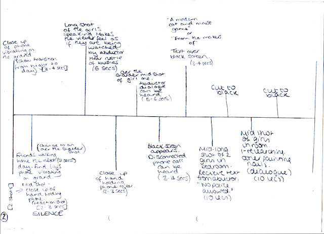
Planning
For the first part of my planning we did the synopsis of our trailer. We wrote it on A3 paper so we could all put across our ideas before finally agreeing on something. We found it quite easy to write this as we had a clear idea on what we would like to do. We had already decided on a genre (thriller) so to make up the trailer we just had to research more into thriller films to decided what kind of film we would make.
After that we made a basic story board on what we would like to happen in our trailer. However we feel that we will make many changes to this as it is only our first thought. Although it is only a basic plan I believe it will help us with our final idea and product as the key themes are in it, such as a girl going missing and the friends are the ones to save her.
The last bit of planning we did was to discuss the mise-en-scene of our trailer. Like the story board it was only a basic plan and is likely to change as we developed our idea. However the setting is something everyone agreed on and what would work well for out trailer, This is because dark, creepy alleyways is something that is used a lot in thriller films and it will be easy for us to film in one as there are loads around.
Saturday, 13 August 2011
Thriller films
I have looked into other thriller films as I want to see how they lay out their trailers. Below you can see three different thriller trailers in which I have Print Screened vital parts in which the tension is being built and moments in which you can see, without the need for any sound or other parts of the film, something dramatic is about to happen.
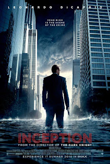
Inception
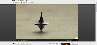 By just having this shown on the screen it shows it must have great importance to the film as it is the sole item on the screen with all the audiences focus on it. It builds tension as no-one knows what it is or what it does and it stays on the screen for 3 seconds with nothing else being shown.
I found this clip very interesting as it is an over the shoulder shot of a man looking out of his window and seeing all the chaos in the street below. All the people are running towards them building tension as we believe they are coming towards him.
This very simple reaction shot builds tension as we see the expression very clearly on his face. When a trailer has these in the audience is able to see characters feelings without them actually having to say or do anything else.
This last shot I picked out from the trailer is one where we see both characters but in different ways. The girl at front shows a emotion of fear/confusion where are the man in the background is more dominant even though he is further away from the screen.
The Shining
This is one of the first shots that are shown in the trailer and straight from it, it builds tension as the one man sitting in the huge space is suspicious as it just seems wrong.
The clip of a hospital with no one there also causes this suspicion as hospitals are seen as busy places. It builds up tension as well as the audience wonder why there is a hospital being shown and link it with the man in the house.
This shot is very sudden as before all other shots are of just empty rooms. And it is quite near the start of the trailer as well causing us, the audience, to wonder what he is going to do.
This mid/close up shot of the boy screaming and looking scared builds the tension up dramatically as we do not know what he is screaming up but guess it is to do with the man with the axe.
This shot is very famous because it shows the reaction of the character so well as you can see the menace is his eyes and because he has broken through a wooden door it makes is more dramatic.
The Sixth Sense
The opening shots are that of traffic with ambulances and police men all around. Straight from the start we then see that something terrible must have happened.
This basic shot of a red balloon floating up can be concept to mean a lot more, the red indicates danger/death/blood and because it is a balloon which is normally associated with children and fun causes tension as the audience wants to understand more.
This close up shot of a child's face crying and looking scared causes the audience to feel for the child and wants to know why he is crying.
This scene is cleverly done because although puppets are seen as a child's toy many people are scared of them. So to put a child in a room with lots of them causes fear for people.
By looking at these three trailers I have become more aware of what is needed in a thriller trailer but also what is not needed.
Inception
 By just having this shown on the screen it shows it must have great importance to the film as it is the sole item on the screen with all the audiences focus on it. It builds tension as no-one knows what it is or what it does and it stays on the screen for 3 seconds with nothing else being shown.
I found this clip very interesting as it is an over the shoulder shot of a man looking out of his window and seeing all the chaos in the street below. All the people are running towards them building tension as we believe they are coming towards him.
This very simple reaction shot builds tension as we see the expression very clearly on his face. When a trailer has these in the audience is able to see characters feelings without them actually having to say or do anything else.
This last shot I picked out from the trailer is one where we see both characters but in different ways. The girl at front shows a emotion of fear/confusion where are the man in the background is more dominant even though he is further away from the screen.
The Shining
This is one of the first shots that are shown in the trailer and straight from it, it builds tension as the one man sitting in the huge space is suspicious as it just seems wrong.
The clip of a hospital with no one there also causes this suspicion as hospitals are seen as busy places. It builds up tension as well as the audience wonder why there is a hospital being shown and link it with the man in the house.
This shot is very sudden as before all other shots are of just empty rooms. And it is quite near the start of the trailer as well causing us, the audience, to wonder what he is going to do.
This mid/close up shot of the boy screaming and looking scared builds the tension up dramatically as we do not know what he is screaming up but guess it is to do with the man with the axe.
This shot is very famous because it shows the reaction of the character so well as you can see the menace is his eyes and because he has broken through a wooden door it makes is more dramatic.
The Sixth Sense
The opening shots are that of traffic with ambulances and police men all around. Straight from the start we then see that something terrible must have happened.
This basic shot of a red balloon floating up can be concept to mean a lot more, the red indicates danger/death/blood and because it is a balloon which is normally associated with children and fun causes tension as the audience wants to understand more.
This close up shot of a child's face crying and looking scared causes the audience to feel for the child and wants to know why he is crying.
This scene is cleverly done because although puppets are seen as a child's toy many people are scared of them. So to put a child in a room with lots of them causes fear for people.
By looking at these three trailers I have become more aware of what is needed in a thriller trailer but also what is not needed.
Monday, 18 July 2011
Task
This year for my media project I have decided to make a film trailer. I am going to be working with Charmaine and Jeni as we are to work in groups to produce it. I have been looking up how film trailers have changed over the years and what they involve and how they make them. I created a small presentation to show to my class that shows what I have discovered, I based my research on thriller/horror movies as I already think making a trailer in that genre would be very interesting and fun to do.
And here are the links to the YouTube trailers form the presentation:
And here are the links to the YouTube trailers form the presentation:
Subscribe to:
Comments (Atom)


