EMPIRE
When finding front covers of magazines I decided to look for ones that are seen as frightening or threatening. This is because our film is a thriller which has an element of horror in it so I would not want to make a cheerful magazine with lots of bright colours in it. Here are the best three I found.
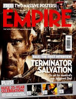
This cover caught my eye as it you cannot fully see this mans face but just around a third of it whist the rest in is the dark. This gives the audience a feel of fear from him and we know that straight away it will be a horror/thriller film. Also the colour of the text is in red and very bold with huge text, causing it to stand out and catch peoples eye. The use of red also shows how it represents danger, or how the man in the front is dangerous to us. I believe this is a good front cover as just by looking we gain an understanding of what type of film it will be and of course the name of it as it stands out almost as much as the title of the actual magazine.
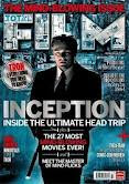
Unlike the magazine above this does not give us a sense of horror but more of curiosity. The man at the front (Tom Hanks) is obviously going to be the main character as we fully see him and is in full lighting, showing he has nothing to hide from. However the man behind him is in dark colours and shadow over half of his face causing him to look as though he is hiding, it also causes us to be curios as to what he is going but also know he is an un-liked character. The background on the cover gives an eerie feel as it looks like mist/fog on a dark night which we represent with horror and fear. However I do not like how dark the title of the film is as it does not stand out against the background and can be hard to see at first glance.
 Although this cover is not one of horror I liked it because of the colours used and the layout of it. This is because all the colours are dark and brown giving an eerie feel to the cover. The layout I find is very effective as we gain a closeup of the main character in the film and in the background we see a machine of some kind but we do not get a full picture of what is happening, I believe this is good as the audience want to know what is going on and what the thing is in the background. With the title being big and bold and in white it stands out against the brown background so the viewers know what it is called.
TOTAL FILM
The layout of this magazine is slightly different to that of Empire. This is because Total Film magazine covers are mainly of the photo with only a small amount of text on the page. When i researched front covers for this magazine I looked more for the type of picture used rather then the type of film this was so I could see what type of photo would look the best then use the colours I researched on the magazines above and edit them together.
 This photo I find very effective as he is standing in the centre causing him to seem very important, the clothes he is wearing and his posture also cause this. I also like the way 'FILM' is made. It is photos from the film put inside the text and I feel this works very well and could be something we do in our magazine. However what I do not like is the layout of the cover with all the text put down the middle and o not feel the colours of the text is right. The white of the text almost disappears at times as it is too close to the background colour.
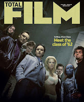
 I really like this front cover as it is virtually just a photograph of all the main characters in the film with a small section of text just saying what the film is called. I really liked this because there is nothing else on the cover to distract our eyes so we can fully appreciate the photo. The photo itself is very good as it makes it look as though they are looking down on the reader causing them to look powerful and fearful. The colours are also very good in the fact they are quite dark with only one section where light is being let in. The facial expressions are all the same as well of them having a straight expression and staring into the camera.
  The thing I like about this magazine cover is mainly the layout of it as it is set in thirds which can easily be seen by Johnny Depp being on one side then the majority of the text on the other instead of it all overlapping each other making it harder to focus on one thing. Also I like the photograph being of Johnny Depp because he is such a famous and popular actor that when people see him on a magazine cover people will want to read what it is about and if it is promoting a new film people are more likely to see it if it has actors they like in it. This is the magazine front cover I like the most because of the layout and photo, however I do not think the colours will work well for our horror/thriller trailer so I would use this mostly as a template but then change the colours of it all to fit my theme.


No comments:
Post a Comment