The clothes, make-up and hair are all very important for all three parts of our project. If we do not get it right it could jeopardise everything.
LILY
'Lilie's' make-up needs to be smudged and made to look as thought she has been wearing it for ages but if instead looks perfect it will not give the effect of her being drunk and had a good night. Also when she is trapped in the cupboard her face needs to have black smudges all over it causing it to look dirty and as though she has been there for a while.
The clothes she is wearing is a bright red dress to represent the danger that she brings. However she is also wearing a white cardigan to contrast the red to show her innocence and purity. These colours work well together as we see how she is in danger but also how she has no idea when, where, how or why.
Her hair needs to be slightly messy at the beginning after the party otherwise if it was perfect it would not give the right impression of her being to a party and getting drunk. At the end of the trailer when she is in the cupboard her hair needs to be very messy as she would have been trapped in there for a while and trying to escape.
SHANNON
Her make-up and hair can be normal with it being very plain and simple for example her make-up would be very limited as she is more worried about finding her friend and her hair can either just be tired up quickly or let down to show she has not had much care put into it.
Her clothes ate much like Lily's but the other way round. When she is putting pieces together to try and find her she is wearing a white shirt with jeans and when she has gone outside to find her she is wearing a red and black cardigan. This shows how alike her and Lily are and also how her purity of trying to find her friend may lead her into danger especially the closer she gets to finding her friend.
CHELSEA
Her make-up and hair are different to that of the other two characters. She takes more take and does she make-up nicely with more on as well. Her hair will either be up but put up nicely or down and straightened. This shows she cares more about her appearance than finding her friend.
Her clothing will be dark either a black, dark green or dark blue. This shows she is mysterious and can hide away and does not stand out easily. Showing she does not care about anything but also that she could have something to hide about their friends disappearance.
ABDUCTOR
Although they are only in it for a short amount of time there clothing is very important. They will be wearing a big jacket in a dark colour, preferable black. This is so the outline of the person could be false and just the jacket shape. We may make him wear a hat to disguise his head more but this is not essential.
Thursday, 8 December 2011
Lighting of the trailer
When filming our trailer for the movie one of the hardest things we discovered and still discovering is how to use the lighting.
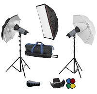 Because we are filming the majority of our trailer outside in a field we cannot use professional lighting such as the ones seen to the right because we have no source of electricity. This causes us many problems. We want the first section of our trailer to be filmed in the dark but we need some kind of lighting so the characters can be seen. So to try and overcome this we came up with a few ideas the first was to film in the daylight and then edit it to make it look as though we filmed in the daytime. But if you look at our second set of shots video it can be easily seen that the shadows from the sun can be seen on the floor making the clips look like they have been filmed in the daylight even with editing involved which is what we did not want. Our next idea was to simple film in the dark but use lots of torches to light up our character. Although this was better (see third set of shots) on some clips it is easily seen that we used these which is also what we do not want. So when we go filming again us have decided we will get even more torches but this time get big ones and place them on the floor so we do not have to hold them on the character but just so there is a background light and the character can be seen so it does not look wrong. Also it means there is not a person running along with 'Lilie' trying to keep lighting on her, if there are lots of torches perhaps in a line.
 Because we are filming the majority of our trailer outside in a field we cannot use professional lighting such as the ones seen to the right because we have no source of electricity. This causes us many problems. We want the first section of our trailer to be filmed in the dark but we need some kind of lighting so the characters can be seen. So to try and overcome this we came up with a few ideas the first was to film in the daylight and then edit it to make it look as though we filmed in the daytime. But if you look at our second set of shots video it can be easily seen that the shadows from the sun can be seen on the floor making the clips look like they have been filmed in the daylight even with editing involved which is what we did not want. Our next idea was to simple film in the dark but use lots of torches to light up our character. Although this was better (see third set of shots) on some clips it is easily seen that we used these which is also what we do not want. So when we go filming again us have decided we will get even more torches but this time get big ones and place them on the floor so we do not have to hold them on the character but just so there is a background light and the character can be seen so it does not look wrong. Also it means there is not a person running along with 'Lilie' trying to keep lighting on her, if there are lots of torches perhaps in a line.
Monday, 5 December 2011
Adding text into the trailer
In our trailer we needed to add text into it to show the title of our film, star ratings and the phrase "A MODERN CAT & MOUSE GAME" in between clips. These also help break the film clips up causing the clips to become quicker and quicker without it looking wrong. For example after the phrase it shows 'Lilie' then running and looking back whilst looking scared whereas before it was just clips of her moving slowly being slightly intoxicated. This tells the people watching that an event has taken part and her reactions have now changed dramatically.
Another text screen we wanted was one to show the title of our film and put star ratings on it. This caused us a lot of problems as we could not find a suitable star image. To over come this I cropped a poster with 4 stars on it and a black background and created the image below.
However this still caused us problems as we could not transfer the Photoshop picture onto the slid on MoviePlus. So from there we went into Word and tried to see if there was a star symbol that we could use which would easily be able to use on our slide as we could just enter a text box and type it in. However there was no symbols that were star shaped. In the end we decided to use the '*' key to see if it would look good or not. Luckily when we made the symbol bigger it looked good and professional. From this we decided we will just use the '*' symbol as our star sign.
For our text as well we added an effect to make it glow before showing the text this makes it look eerie and scary which was what we wanted in our text. It keeps in with the theme of a thriller film and like the film you have to wait to see what happens or what it reads in the case of the text.
Research on magazine front covers
For our other ancillary task we are asked to produce a front page for a magazine, promoting our film. Before we start making the cover I have researched into two different magazines to see the layout of them and the style of which they use to promote their films.
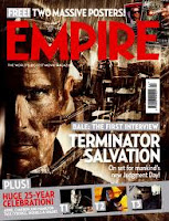 Although this cover is not one of horror I liked it because of the colours used and the layout of it. This is because all the colours are dark and brown giving an eerie feel to the cover. The layout I find is very effective as we gain a closeup of the main character in the film and in the background we see a machine of some kind but we do not get a full picture of what is happening, I believe this is good as the audience want to know what is going on and what the thing is in the background. With the title being big and bold and in white it stands out against the brown background so the viewers know what it is called.
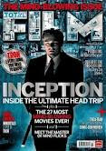 This photo I find very effective as he is standing in the centre causing him to seem very important, the clothes he is wearing and his posture also cause this. I also like the way 'FILM' is made. It is photos from the film put inside the text and I feel this works very well and could be something we do in our magazine. However what I do not like is the layout of the cover with all the text put down the middle and o not feel the colours of the text is right. The white of the text almost disappears at times as it is too close to the background colour.
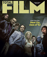 I really like this front cover as it is virtually just a photograph of all the main characters in the film with a small section of text just saying what the film is called. I really liked this because there is nothing else on the cover to distract our eyes so we can fully appreciate the photo. The photo itself is very good as it makes it look as though they are looking down on the reader causing them to look powerful and fearful. The colours are also very good in the fact they are quite dark with only one section where light is being let in. The facial expressions are all the same as well of them having a straight expression and staring into the camera.
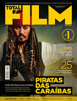 The thing I like about this magazine cover is mainly the layout of it as it is set in thirds which can easily be seen by Johnny Depp being on one side then the majority of the text on the other instead of it all overlapping each other making it harder to focus on one thing. Also I like the photograph being of Johnny Depp because he is such a famous and popular actor that when people see him on a magazine cover people will want to read what it is about and if it is promoting a new film people are more likely to see it if it has actors they like in it. This is the magazine front cover I like the most because of the layout and photo, however I do not think the colours will work well for our horror/thriller trailer so I would use this mostly as a template but then change the colours of it all to fit my theme.
EMPIRE
When finding front covers of magazines I decided to look for ones that are seen as frightening or threatening. This is because our film is a thriller which has an element of horror in it so I would not want to make a cheerful magazine with lots of bright colours in it. Here are the best three I found.
This cover caught my eye as it you cannot fully see this mans face but just around a third of it whist the rest in is the dark. This gives the audience a feel of fear from him and we know that straight away it will be a horror/thriller film. Also the colour of the text is in red and very bold with huge text, causing it to stand out and catch peoples eye. The use of red also shows how it represents danger, or how the man in the front is dangerous to us. I believe this is a good front cover as just by looking we gain an understanding of what type of film it will be and of course the name of it as it stands out almost as much as the title of the actual magazine.
Unlike the magazine above this does not give us a sense of horror but more of curiosity. The man at the front (Tom Hanks) is obviously going to be the main character as we fully see him and is in full lighting, showing he has nothing to hide from. However the man behind him is in dark colours and shadow over half of his face causing him to look as though he is hiding, it also causes us to be curios as to what he is going but also know he is an un-liked character. The background on the cover gives an eerie feel as it looks like mist/fog on a dark night which we represent with horror and fear. However I do not like how dark the title of the film is as it does not stand out against the background and can be hard to see at first glance.
 Although this cover is not one of horror I liked it because of the colours used and the layout of it. This is because all the colours are dark and brown giving an eerie feel to the cover. The layout I find is very effective as we gain a closeup of the main character in the film and in the background we see a machine of some kind but we do not get a full picture of what is happening, I believe this is good as the audience want to know what is going on and what the thing is in the background. With the title being big and bold and in white it stands out against the brown background so the viewers know what it is called.
TOTAL FILM
The layout of this magazine is slightly different to that of Empire. This is because Total Film magazine covers are mainly of the photo with only a small amount of text on the page. When i researched front covers for this magazine I looked more for the type of picture used rather then the type of film this was so I could see what type of photo would look the best then use the colours I researched on the magazines above and edit them together.
 This photo I find very effective as he is standing in the centre causing him to seem very important, the clothes he is wearing and his posture also cause this. I also like the way 'FILM' is made. It is photos from the film put inside the text and I feel this works very well and could be something we do in our magazine. However what I do not like is the layout of the cover with all the text put down the middle and o not feel the colours of the text is right. The white of the text almost disappears at times as it is too close to the background colour.
 I really like this front cover as it is virtually just a photograph of all the main characters in the film with a small section of text just saying what the film is called. I really liked this because there is nothing else on the cover to distract our eyes so we can fully appreciate the photo. The photo itself is very good as it makes it look as though they are looking down on the reader causing them to look powerful and fearful. The colours are also very good in the fact they are quite dark with only one section where light is being let in. The facial expressions are all the same as well of them having a straight expression and staring into the camera.
  The thing I like about this magazine cover is mainly the layout of it as it is set in thirds which can easily be seen by Johnny Depp being on one side then the majority of the text on the other instead of it all overlapping each other making it harder to focus on one thing. Also I like the photograph being of Johnny Depp because he is such a famous and popular actor that when people see him on a magazine cover people will want to read what it is about and if it is promoting a new film people are more likely to see it if it has actors they like in it. This is the magazine front cover I like the most because of the layout and photo, however I do not think the colours will work well for our horror/thriller trailer so I would use this mostly as a template but then change the colours of it all to fit my theme.
Subscribe to:
Comments (Atom)


